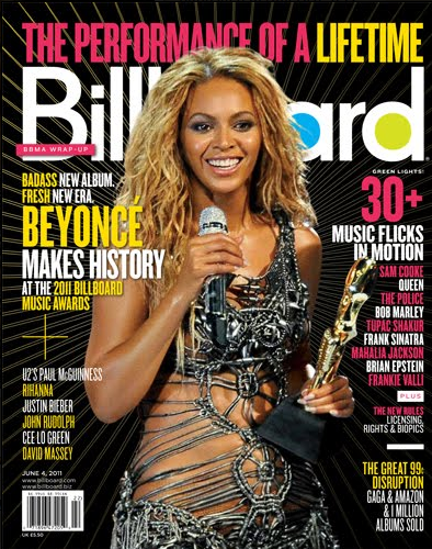
I tried to include as many conventions in my magazine as any other music magazine in the media today. Conventions are those such as the masthead, cover Lines, barcode, selling line, main image, exclusive extra, date and serif font.
Firstly, my masthead which I was inspired to use by the 'we <3 pop' magazine was incorporated into my own version. I Continued to use the love heart in between the title 'we <3 music' for mine. I have followed the typical magazine conventions of having the title at the top of the front cover from left to right. Many music magazine readers understand and are able to tell its a music magazine straight by the image because those usually used are the famous celebrity singers or bands. My magazine demonstrates that it is not this that gives away that it's a music magazine yet it is my title. My image also sits behind the masthead which is were I have actually challenged the convention because many well known magazines have their image slightly placed over the masthead. I have not done this though as my magazine is not as well known.
I have added a barcode to my magazine to make it more authentic. I added this to the bottom right of the page including a price to. By looking at other magazine to, I could also add an issue number and/or date underneath the barcode to include extra detail
Another important convention I used was that of an extra. I included things such as posters inside and the sentence 'EXCLUSIVE INTERVIEW'. These two things will make the reader even more intrigued to read inside.
To my magazine, I have added some of the popular Social platforms to my contents page. Things such as twitter, facebook, instagram and an email address. By mentioning the Social Platforms in my magazine I am showing the audience that it's a well known/spoke about magazine. Many magazines are now using New Media to advertise themselves. By having my magazine online allows the audience to view it over these well known websites and gives them a closer insight on what the magazine is all about and means they don't have to go the shop to just view it and buy it.
Images are a big part of the magazine and which ones I used needed to be used correctly and link with the music genre of my magazine which was pop. The image on the front cover is one of the main things in which help the audience decide whether its their type of magazine style or whether they are just interested in the image it's self to read on. When researching about magazine front cover images, I found that quite a few of the models were looking straight at the audience which connects with them where as my model is looking in the right direction and away from the audience. I think this gives the impression to the audience that this is a typical teenage girl with attitude and goes with the pull quote which was, 'THE TEARS, FAME & LOVE'.
As I speak about in my next few posts about the target of my audience, my magazine is aimed at teenage girls so I had to choose carefully about what my model was going to wear. As many girls to this day go for the casual jeans look, I decided for this to be the look. These two basic colours worn by the model made it very easy to choose a colour scheme which helped compliment and blend the colours all together and work well. When I first took the photograph, the image was quite dull so with the help of photo shop and the skills I had, I knew how to improve the quality of this image and that's what I done.
When using text, I chose carefully on what to use as I didn't want to use a text with really sharp edges or too bubbly as this made the music genres change from something which was not pop. The text I used throughout was 'cooper sans' and 'century gothic'. Both of which are very simply texts but are both effective. I decided to stick to these texts throughout the whole magazine and did not go over board with them.
The last thing I had to think about was the whole layout of my magazine. This will either make or break your magazine. I followed the magazines such as 'billboard' and 'top of the pops' to help create the image and layout of mine. My front cover is very similar to this image below. My model is standing centrally and has writing to the left and right of her. The only thing different really is that my barcode is on the right side instead of the left. I added in more conventions that this magazine did not use. One of them was the banner at the bottom of my page with free posters included.


No comments:
Post a Comment