Tuesday, 14 January 2014

analysing the double page spread of the 'we love pop' music magazine.

Lastly the double page spread shows a large dominant image of Justin Bieber on the right, quite similar to the one on the front cover in the way that there's one large dominant image with others around it.

They use the contrasting colours technique again using red, white and black to make the interview stand out. Also, in many of the 'we love pop' interviews they like to highlight important parts of the interview (this time in red) to help quickly guide the reader to the most interesting areas. I will be using this style model to create the double page spread look for my music magazine.


analysing the 'we love pop' contents page

When analysing the contents page, I found that the magazine continues on with its informal nature by using typical teen phrases and also through the continuation of bright and bold text. Even though the language is informal it is obvious that it is aimed at mature teenagers by looking at some of the different topics and play-on-words used which can be found on the contents page.

They also have an editors letter which follows the conventions of a typical magazine and allows the audience to get to know a bit about the 'we love pop' team.


analysing 'we love pop' magazine colour scheme

I found that there were many bold, bright, stand out colours that ran through out the magazine issues. This technique helps the magazine to stand out from the others and catch the eye of potential buyers.

The layout of the front cover is very busy but still sticks to the typical conventions of a magazine. For example, the main image which is placed slightly more to the left or right, the other images and texts which fall around it and the smaller images located around the edges.


analysing the front cover of 'we love pop' magazine

From the magazines logo alone, it is quite easy to recognize its target audience which appears to be aimed at teenage girls from the age of around 7-8 and upwards. The same can also be said concerning the genre as the word 'pop' is included in the magazine name allowing the target audience to recognize the musical genre straight away without having to read the contents.
 
The title of this magazine is very plain and simple as it only contains two words which are 'we' and 'pop' and the word which should have been 'love' is replaced with an actual love heart highlighting the magazines informal nature which again is appealing to the younger audience as the majority of teenagers are associated with slang and informality.

Wednesday, 8 January 2014

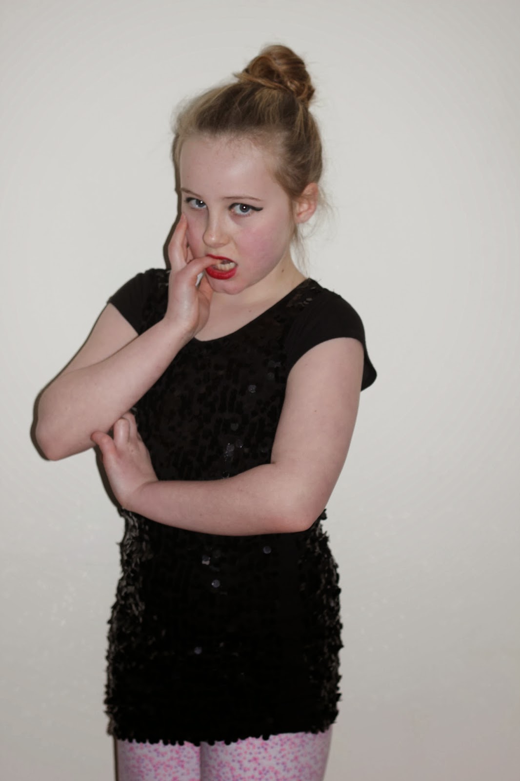
I have been studying a large variety of music magazines and many celebrities involved in the music industries. I also took a closer look at those celebrities involved in the pop world music. I chose this due to the fact that my music magazine is aimed at the music genre 'pop'. I created a similar look on my model and tried to follow the pose. Here are many of my examples.


For these images, we used a hair dryer to try and pull of this look. It was tricky as we do not have the same resources as Taylor Swift, but we still attempted our best.