Thursday, 12 December 2013

more photographs to select from

 
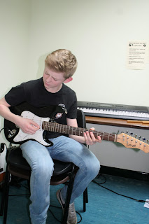
These imaged were draft photographs so I had plenty to choose from. As I studied more about music magazines I was certain that I wanted to do a pop music magazine resulting in these not being suitable for a 'pop' magazine. They fall into the 'rock' category. People would tell this by the clothes worn and the props used for example the electric guitar and the drum set.


Wednesday, 11 December 2013

eye makeup tutorial

http://www.youtube.com/watch?v=9Xs3cNBqF88

  • I used this tutorial to help me design my models eye  makeup as it was a tutorial for Miley cyrus and it was once of her music magazine covers that influenced me.


The audience for my music magazine.

The style model for my music magazine are magazines such as 'top of the pops' and 'we love pop' styles which are both pop music.
The 'We love pop' magazine tends to have their main celebrity either more to the left or to the right on the front cover which leaves more space down one of the sides of the picture to include writing and maybe more images. The 'Top of the pops' music magazine has their image more centrally so for my music magazine I have an option of which style model I would like to base my ideas on.


The audience for my magazine
 
The age band will be 8 year olds and older. The gender will be females and for anyone that takes an interest to pop music. My music magazine will include free goodies such as posters and a free top of the range makeup accessory for each issue purchased. The first issue will be giving away a Barry M nail varnish.


Draft photographs

Here are many of my planned photographs. I got the individual to model for my music magazine cover.
Firstly, without a doubt, these images have something to do with music. We can tell this by the props used and the outfits worn. A guitar represents music. This guitar is modern and represents anything from Country music to the pop genre. The clothes worn also represent this type of music for example the leather jacket. I also designed this makeup to provide the audience with the knowledge that this represents music.

In my images, I kept the lighting to a natural colour but specifically had my model wearing black and red to stand out against the white backgrounded wall. This makes the photo look profession. As you can see, many of my images need to be cropped and edited due to the things going on beneath the picture such as the cushions.


Magazine front cover plan

  • The plan is to take many music styled pictures designed by me. I will get the individual to wear clothes so that it is obvious to the audience that it's a music magazine even without props. The person will wear a red top and black leggings with a black leather jacket. The makeup will also be a hint towards the music genre. Smokey black eyes. These fit in any genre of music but mine is aimed at pop music.
  • The background will be a plain white background and I will use natural lighting in the room. I will use the flash on the camera to present a clear image and to capture every little detail.
  • I was influenced by magazine front covers by the likes of Tulissa, Lady Gaga, Jessie J, Miley Cyrus and Taylor Swift. All of which are worldwide, well known artists and have a lot of attitude. I reflected this in my images by directing the model to use attitude throughout.

Many photographs influenced me, as did the closeup images I discovered. Here are a few of the magazine covers I were influenced by:


Contents page

My contents page will include things such as..

  • Images with page numbers. These images will link in with whats on the page that the audience are directed to.
  • An interview with the celebrity.
  • Recent news about them.
  • A chance to win a meet and greet with a celebrity.
My double page spread:
  • will be the more of the interview continued. 
  • Albums


Wednesday, 13 November 2013

Audience profiles for Kerrang and Que.

Kerrang

  • This is aimed at those who are into heavy metal and/or rock music. 
  • This magazine is aimed at those from the lower class (C-D).
  • The target audience is aimed to a niche audience because it concerns topics and themes that are relevant to people who listen to and are interested in rock music an it's background.
  • This consists of 60% males and 40% females.
  • The predominate ethnicity of the readership is white British around 16-24 of age.
87% of users purchase every issue that is released.
The readership of this magazine is 396,000.

Q
  • This is aimed at those in upper working class (A-B) as it's a dearer magazine than Kerrang.
  • This is aimed at the older generation of music buyers, just over the 25 age catagory for both males and females.

Target audience for my magazine

For the music magazine there are many things that I need to take into consideration. Once I have a clear answer for each i can then aim to impress.

Firstly there is the age of the target audience. This is the age I am aiming my magazine at whether it be young adolescents to teenagers and adults.

Secondly, the gender, whether this be males or females. This will vary on the genre of the magazine and who likes what.

Then there is the type of artists or bands. This depends on the type of music people are into and who's fan base they are involved with.  This may bring people into reading my magazine because they'd be very interested if their favourite singer/songwriter was on the front cover.

Demographic. This is what class my audience come from whether it be aimed at a lower class market (C-D) or upper class (A-B). This all depends on the pricing.

Monday, 11 November 2013

Thursday, 7 November 2013

conventions of first magazine cover

Here is the first magazine cover where i labelled off some conventions.
Things included in this are :


  • Drop capitals which are really big letters that start off an article.
  • A pull quote which catches the readers eye and is directly from the celebrity themself. A pull Quote can still be on the front cover from another person that does not feature on the front cover though.
  • anchorage. This is a text informing you who is in the image and in this case its Justin Bieber.
  • Cover lines which are used to give information about the article and what it contains.
  • A significant image which is in very high quality.
  • The house style which for this magazine was kept consistent thoughout.
  • The mast head. This is used for the simple reason in that the reader knows what they are reading.

The challenging convention

The challenging convention on this music magazine is the barcode. This magazine cover does not include a barcode. This can be found else where though such as the contents page or the back page.

pull quotes used in both


Both magazines also use pull quotes directly from the celebrities themselves which makes the magazines more interesting for not only those reading the magazine but those who are fans of the celebrities.

A similarity which both my magazine front covers have


Tuesday, 5 November 2013

magazine covers research

I looked at various different magazine covers such as kerrang, pop ect and I chose 2 to save to then label on my power point presentation.

the conventions of a magazine video

http://www.youtube.com/watch?v=cekn-PtX0yE Here is a link to find out in more detail, information about the conventions of a music magazine.

Tuesday, 15 October 2013

I have written page numbers and a title next to each one to illistrate what is on that page and this is very useful for the reader.

images

I have used these images to illistrate the kind of things included within my magazine.

contact us

Adding this option to our school magazine cover shows that the school is open to anyone that has any questions about the school.

blend tool

In my Mast head on my front cover, I used the blending tool. This enables my text to stand out twice as much than without it. This helps catch the readers eye.

pre-lim magazine cover

Here is my Pre-lim magazine cover which I have been working on. I started with an image and added suitable text which relates to the school as it is a school magazine.

  • I added the issue number as every magazine has one of these.
  • I also added 'Record numbers in the sixth form' as this is impressive to read and the colour i've chosen to writ it in is eye catching and is the first thing that you look at.
I do like my front cover magazine but there are a few things that I would and wouldn't do when designing a future cover.

strengths:
  • My use on photoshop as a whole has improved
  • using the blending tool to make text stand out
  • the variety of the colours all compliment one another
improvements:

  • Have less space between the 2 pupils in the image
  • Make sure that the text is not on the pupils face.
  • more accurate refrence to a style model.